The Basics of CSS
Getting to Know Inspector
For the purpose of this workshop, I will be using Chrome to demonstrate how we can use inspector to learn and test css. But inspector works just about the same for all other browsers, so you shouldn't have too much difficulty following along even if you are not using Chrome.
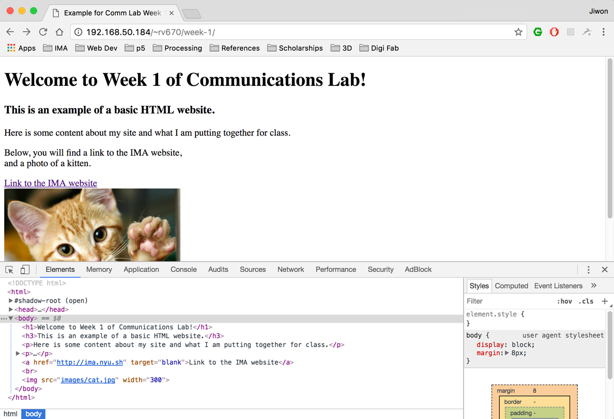
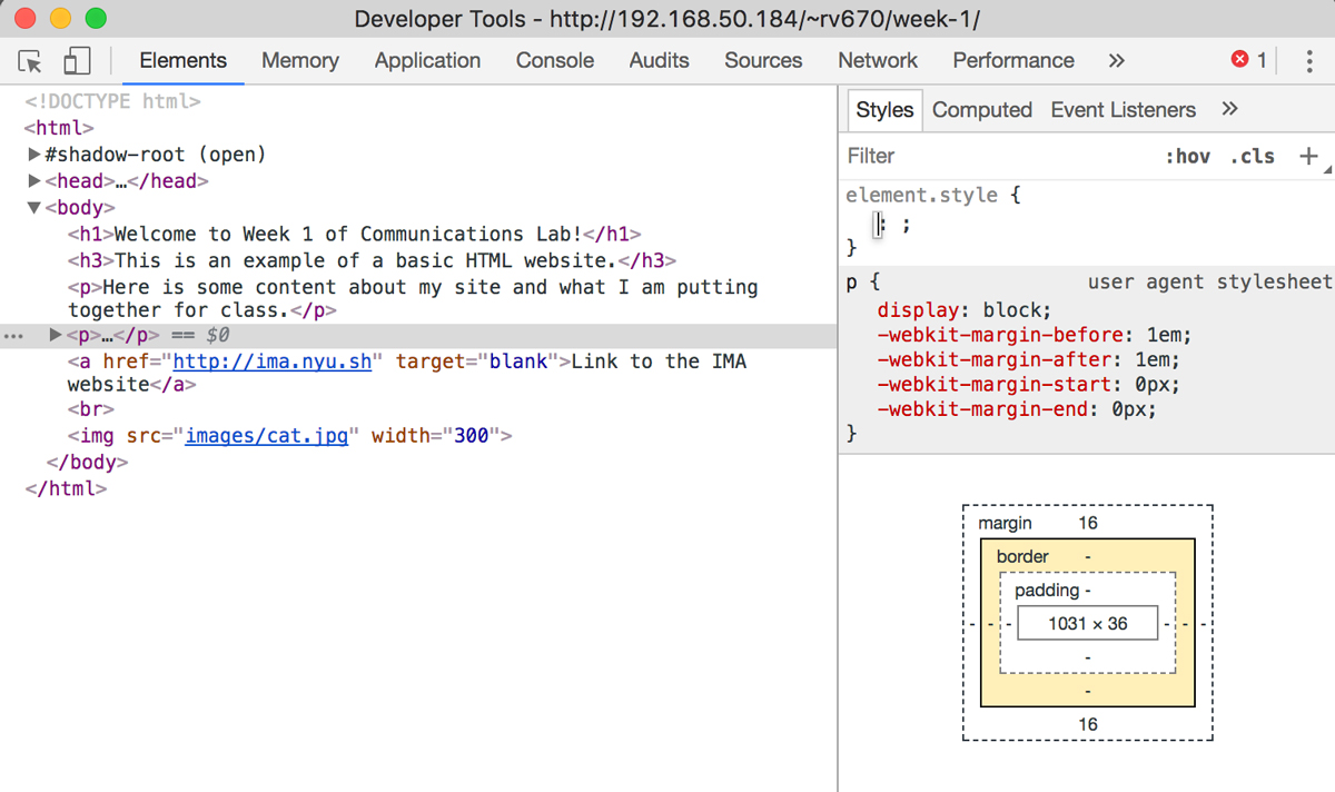
When you pull up the inspector window, by either right click > Inspect or on the menu: View > Developer > Developer Tools, you will see a window pop up, like in the image above.
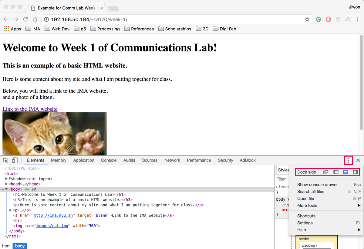
You can change the location of this window by clicking on the "more" icon with three dots. There, you will be able to select your Dock side. The first option will make your inspector a separate window, and the rest three options will change which side of the browser the inspector window is attached to.
For now, we will focus on what is on the Elements tab of the inspector window. We will learn about how to use the Console tab for javascript soon as well. In the Elements tab, you will see that the left side of the inspector displays the html code, while on the right side shows the css of the selected html element. In the image above, I have clicked on the body html tag, so it shows the css associated with the body tag on the right side. As this website contains raw html code, it doesn't seem to have any special styling. However, an important thing to note here is that there is some default css that exists for the body html tag itself, which is:
body{
    display: block;
    margin: 8px;
}
Let's take this opportunity to review the syntax of css. First, we see the selector, body. This means that the css declarations inside of the curly brackets are for this particular selector, in this case, a html tag. Remember that we can use 3 different types of selectors: 1) html tags, 2) class name, 3)id name. If we had an html code like this:
<img class="grid-img" id="donut-img" src="img/donut.jpg">
then we can use the class name "grid-img" as our selector like this:
.grid-img{
    width: 500px;
    height: 400px;
}
and we can also use its id name as our selector like this:
#donut-img{
    width: 1000px;
    height: 800px;
}
Let me give an example of the different cases for using an html tag, class name and id name as your selector. Let's say that I am creating a web page with a lot of images. If I want all my images to have a uniform size, I will set this using the img html tag as my selector in my css. If I want to create a category of important images, and want to put a red border around them, I will create a class, maybe call it something like important-img, and use .important-img as my selector to set this style. Lastly, if I want to make an exception and use one particular image to be always fixed on the bottom right corner of my website (maybe it's my "move to top" button), I can do that by giving that particular image an id name (in this case, something like #move-top). The html and css code for this example scenario will look something like this:
html:
<img src="img/normal-img.jpg">
<img class="important-img" src="img/important-img.jpg">
<img src="img/normal-img.jpg">
<img class="important-img" src="img/important-img.jpg">
<img src="img/normal-img.jpg">
<img src="img/normal-img.jpg">
<img class="important-img" src="img/important-img.jpg">
<img id="move-top" src="img/move-top-img.jpg">
css:
img{
    width: 500px;
    height: 400px;
}
.important-img{
    border-style: solid;
    border-color: red;
}
#move-top{
    width: 50px;
    height: 50px;
    position: fixed;
    bottom: 0px;
    right: 0px;
}
Now, let's look at the lines of code inside of the curly brackets. They have a syntax of:
css-property: value;
This is where we can use our new tool, inspector, to explore.
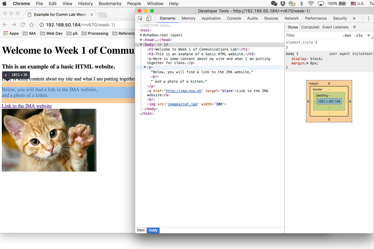
This is the same image that we saw before. Note that there is a section on my web page highlighted in blue, with two orange lines above and below. This section of my webpage is highlighted because my mouse is currently hovering over this particular part of html code inside my inspector. It also has a little indicator above that says "p | 1031 x 36". This means that the selected html code is of an html tag <p> and has width of 1031 pixels and height of 36 pixels at this particular browser size.
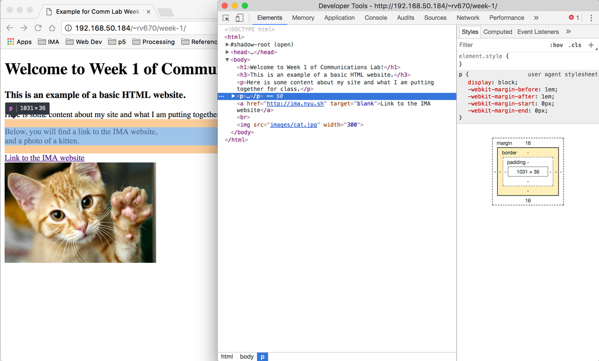
If you actually click on this part of your html code on your inspector, you will see the right side of the inspector window change to display the styles for this element. Right now, same as before, there are no particular styles given.
If you click on an empty space below where it says element.style, a blank template for a line of css declaration will appear. Let's try to change the color of this selected text.
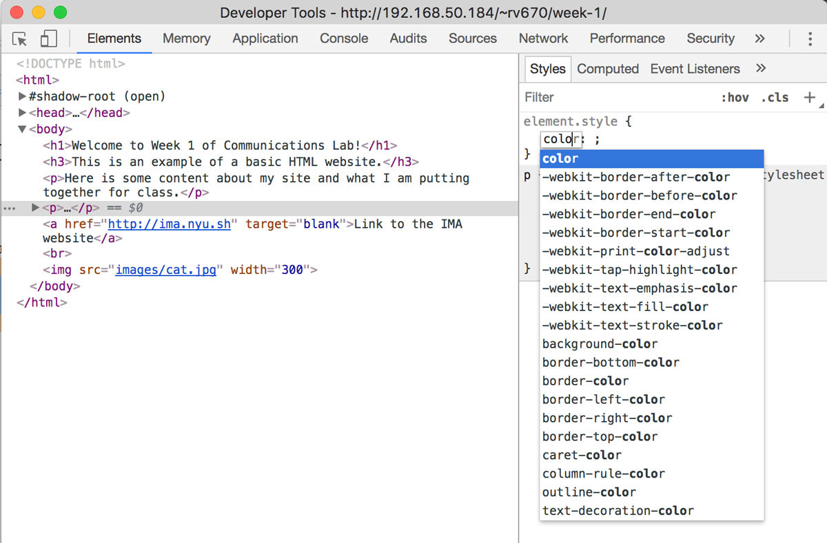
Start typing inside the little text box that appears in place for the css property. Knowing that in order to change the color of the text, the given css property is color, as you type in the word, you will notice that it will inspector will try to auto-fill for you and also display options that contain the characters you have already typed before. Thus, you will be able to see that there is are many other css properties that you can set colors of, such as background-color and border-color.
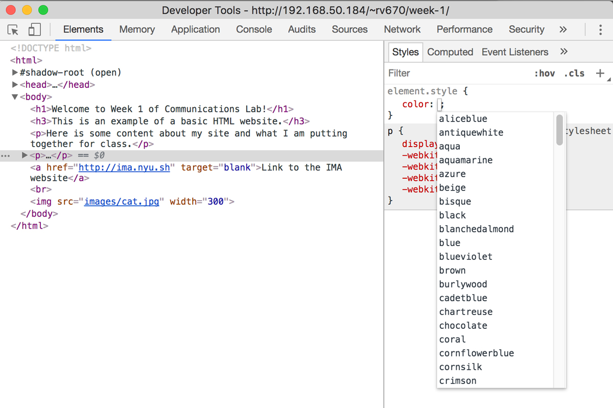
If you hit tab after selecting the css property color, you will see that it also gives you a list of available values for this particular css property. For the color value in particular, it is possible to give it as hexadecimal or RGB, but the options that appear are the colors that can be referred to as a name.
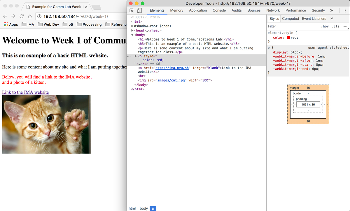
I am going to choose the color red. You will see this particular section of text change its color from black to red immediately after you are done typing the word. A very important thing to note here is that ANY CHANGES DONE ON THE INSPECTOR ARE TEMPORARY. If you refresh the page, the changes you have made, in this case changing the color of text to red, will disappear. The inspector tool should be used for experimenting with css and a way of getting immediate visual feedback of what a particular css declaration does. If you want to actually apply this css style to your web page, you should copy the css code from inspector and save it to your local css file.
For more detailed information about css syntax, please read this w3schools' article. Generally, w3schools website is also a helpful resource in trying to figure out if there is a css property for what you want to do, and what it exactly does.
Box Model, Position and Display Property
Box Model:
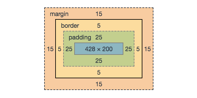
The concept of the box model is crucial for web development and css. The image above is the box model diagram of an element that shows up when you are focused on a particular html element on the inspector. The inner-most blue rectangle shows the box that contains the content of the html element. It shows that the width of the content is 428px and the height is 200px. Next, we see a green rectangle, labeled 'padding', that surrounds the content box. It shows that it has 25px of padding for all four sizes. It can be confusing to choose whether to use padding or margin to give a little spacing between html elements. The difference between padding and margin can become clear if the content has a background-color or background-image. Padding is the space between the content and the edge of the visible area of background-color / background-image. Margin is the space between the edge of the visible area of background-color / background-image and the edge of the browser, or the edge of another html element. Border comes between padding and margin. By default, border-style value is set to "none", meaning that there is no visual border by default, so in order to visually see a border, we need to set the value of border-style to something other than none and override the default "none" value.
It is quite hard to grasp this idea of a box model, so below is a simulator that you can experiment with different values of margin, padding and border. You can also use the simulator to play around with the display and position values.
For more detailed information about the position css property, click on this w3school's link.
For more detailed information about the display css property, click on this w3school's link.
For a full page simulator, click HERE.
Demo: Parallax Web Page
Click to view the demo as a full web page.
Let's start off with creating three divs, one for each background. We will also give class names for each of these sections.
                <div class="section-1"></div>
                <div class="section-2"></div>
                <div class="section-3"></div>
Now, we will give it background images to each of these sections in css.
.section-1{
    background-image: url(img/parallax/bg1.jpg);
}
.section-2{
    background-image: url(img/parallax/bg2.jpg);
}
.section-3{
    background-image: url(img/parallax/bg3.jpg);
}
As of now, nothing will appear on your screen, because you haven't given your html, body and div elements any height yet. If a specific height is not set with css, as all of our html content has height of 0 (div has a height of 0px if there is no content inside of the div - remember that a div element is used just to group html elements and doesn't have any visual qualities) and so the web page does not display anything. So we will set the height of our html, body and the 3 sections of div elements to 100%.
html, body{
    height: 100%;
}
.section-1, .section-2, .section-3{
    height: 100%;
}
One important thing to note in the css above is that, you can give multiple html / class / id elements the same style by linking them with a comma. For example, as I want all of my three sections to share a css property of height 100%, I can do this in one chunck of css by referring to all three classes at the same time by doing: .section-1, .section-2, .section-3
Now, you will notice, depending on the size of your images, the background images that you gave will be either stretched out or tiled to fit the space of your browser. Let's set our background images to be at the center, to not repeat (to prevent the tiling of the image) and to cover the size of the browser.
.section-1, .section-2, .section-3{
    height: 100%;
    background-position: center;
    background-repeat: no-repeat;
    background-size: cover;
}
With this, we have set the size and position of our background so that it auto-adjusts to the size of the browser. However, for now, it looks like as if the images are just placed in order and it doesn't have the parallax effect yet. Now for the one magic line that will create this parallax effect: background-attachment: fixed;
.section-1, .section-2, .section-3{
    height: 100%;
    background-attachment: fixed;
    background-position: center;
    background-repeat: no-repeat;
    background-size: cover;
}
That additional line of css will fix the position of the background image regardless of the scrolling. As it scrolls, it reveals the background of the next div, from bottom to top.
Now we have a basic parallax web page. You can of course, put in div elements with text in between the div elements with the background images. You can also put in content inside of the div elements with background images, to place them along with each of the background image of the section div. Here is the complete html and css code of the demo web page:
HTML:
<div class="section-1">
    <div class="caption">
        <span class="caption-text">Title of Website</span>
    </div>
</div>
<div class="section-text">
    <p>This is a place where you can enter in text content.</p>
</div>
<div class="section-2"></div>
<div class="section-text">
    <p>This is another place where you can enter in text content.</p>
</div>
<div class="section-3">
    <img class="center-img" src="img/cat.png">
</div>
CSS:
html, body{
    height: 100%;
    margin: 0;
    font-family: "Helvetica Neue", sans-serif;
}

.section-1, .section-2, .section-3{
    position: relative;
    background-attachment: fixed;
    background-position: center;
    background-repeat: no-repeat;
    background-size: cover;
    height: 100%;
}

.section-1{
    background-image: url(img/parallax/bg1.jpg);
}

.section-2{
    background-image: url(img/parallax/bg2.jpg);
}

.section-3{
    background-image: url(img/parallax/bg3.jpg);
}

.caption{
    position: absolute;
    top: 50%;
    left: 0px;
    width: 100%;
    text-align: center;
}

.caption-text{
    background-color: white;
    color: #cecece;
    font-size: 42px;
    font-weight: bold;
    padding: 15px
}

.section-text{
    padding: 50px 80px;
}

.center-img{
    width: 50%;
    position: absolute;
    margin: auto;
    top: 0;
    bottom: 0;
    left: 0;
    right: 0;
}