Creating SVG Shapes
What is SVG?
SVG stands for Scalable Vector Graphics. Vector Graphics are usually talked in comparison to Raster Images. The difference between the two can be easily thought by the program we would normally use to create each of them. To create vector graphics, we would normally use Illustrator - and use points, lines and curves to create shapes. To create raster graphics, we would use Photoshop - which are normally comprised of thousands of pixels. For more information about the difference between the two, please refer to this article, that talks about the differences between the two types of images as well as which one to use for different needs. In terms of HTML, there is an <svg> tag that we can use to define Scalable Vector Graphics. Let's first look at how to create basic shapes.
Rectangle:
All <svg> HTML element start with its opening and closing tag. And inside of it, we can use one of the pre-defined basic shapes and use the relevant attributes to define width, height and position. Of course, to style our shapes, we use CSS. The contents inside of the style="" attribute are in CSS.
<svg width="300" height="200">
    <rect height="150" width="250" style="fill:red;" />
</svg>
For rectangles, width and height values need to be given for us to see the shape. In the previous CSS animation workshop, when we used <div> tags to create shapes, we used background-color to define the color of our shape. When creating shapes with <svg> tags, because they are actual shapes, we use the CSS property fill.
We can actually put multiple shapes within the same <svg> tag. This means that you can manipuate each of the shapes inside of the <svg> as well as manipuate the whole as a complete graphic.
<svg width="350" height="200">
    <rect x="50" y="25" height="150" width="100" style="fill:blue;" />
    <rect x="200" y="25" height="150" width="100" style="fill:green;" />
</svg>
We can give x and y values to each shape to pinpoint where exactly the individual shapes should be located within the whole <svg> graphics. For rectangles, the x and y values are used for defining position of left-top corner of the rectangle.
<svg width="250" height="250">
    <rect height="200" width="200" rx="25" ry="25" style="fill:red;" />
&tl;/svg>
You can also give border-radius to the rectangle shape. For <svg> shapes, this can be defined by the values rx and ry. rx standsfor x radius and ry stands for y radius.
Circle:
Circles in &svg> require a center x point, cx, a center y point, cy and a radius, r.
<svg height="200" width="200">
   <circle r="80" cx="50%" cy="50%" style="fill:red; stroke-width: 5px; stroke: black;" />
</svg>
We can also give stroke to our shape, by giving the color of the stroke with stroke css property and using stroke-width css property for the thickness of the stroke.
Ellipse:
Ellipses are similar to circles, only that you need to give x radius, rx, and y radius, ry values.
<svg height="200" width="400">
    <ellipse rx="150" ry="50" cx="50%" cy="50%" style="fill:pink;" />
</svg>
<svg height="250" width="250">
    <ellipse rx="50" ry="100" cx="50%" cy="50%" style="fill:pink; fill-opacity: 0.5; stroke: hotpink; stroke-width: 5px;"  />
    <ellipse rx="100" ry="50" cx="50%" cy="50%" style="fill:lightblue; fill-opacity: 0.5; stroke: blue; stroke-width: 5px;" />
</svg>
We can also give transparency to our fill, by using the css property fill-opacity. The maximum value of fill-opacity is 1 and minimum is 0. You can give in a decimal number between 1 and 0.
Line:
Lines require 2 points. x1 and y1 for the first point and x2 and y2 for the second point.
<svg height="250" width="250">
    <line x1="0" y1="0" x2="250" y2="250" style="stroke: black; stroke-width: 5px;" />
</svg>
Below are different ways of styling the lines, or strokes for shapes. stroke-dasharray is used for defining spaces within the line to create a dash-like effect, and stroke-linecap is used to define the shape of the lines - whether they have a square tip or a round tip.
<svg height="250" width="250">
    <line x1="10" y1="50" x2="240" y2="50" style="stroke: black; stroke-width: 5px;" />
    <line x1="10" y1="100" x2="240" y2="100" style="stroke: red; stroke-width: 5px; stroke-linecap: round;" />
    <line x1="10" y1="150" x2="240" y2="150" style="stroke: blue; stroke-width: 5px; stroke-dasharray: 5, 10, 20, 12;" />
    <line x1="10" y1="200" x2="240" y2="200" style="stroke: green; stroke-width: 5px; stroke-dasharray: 5, 10, 20, 12; stroke-linecap: round;" />
</svg>
You can create more complex shapes by using the polyline and polygon tag. For these, you have to give specific points that would comprise your shape. Each point is written in the for of x,y with a space between each point.
Polyline:
<svg height="250" width="250">
    <polyline points="10,100 60,240 150,10 100,10 190,240 240,100" style="fill:none; stroke: black; stroke-width: 5px" />
</svg>
<svg height="250" width="250">
    <polyline points="10,100 60,240 150,10 100,10 190,240 240,100" style="fill:pink; stroke: black; stroke-width: 5px" />
</svg>
Polygon:
<svg height="250" width="250">
    <polygon points="125,10 10,190 50,240 240,170" style="fill: lightblue; stroke: black; stroke-width: 5px" />
</svg>
Path:
SVG Filters
You can create "special effect" or filters for the shapes you create in <svg>. These also get defined within the <svg> tag. Below are some of the most commonly used <svg> filters, but definitely not all that exist.
Blur:
<svg height="250" width="250">
    <filter id="blur">
        <feGaussianBlur in="SourceGraphic" stdDeviation="5" />
    </filter>
    <circle cx="60" cy="125" r="50" style="fill: green; stroke: black; stroke-width: 5px;" />
    <circle cx="190" cy="125" r="50" style="fill: green; stroke: black; stroke-width: 5px; filter: url(#blur);" />
</svg>
Important thing to note here would be how the filter is linked to the shape within the <svg tag. The <filter> tag as to have an id, for it to be linked to the shape using css. url(#blur) means that the defined filter can be referred to by looking up the id of #blur. Remember that # (hashtag) symbol is used to reference id names in CSS.
Linear Gradient:
<svg height="250" width="250">
    <linearGradient id="grad1" x1="0%" y1="0%" x2="100%" y2="0%">
        <stop offset="0%" style="stop-color: rgb(0, 255, 255);" />
        <stop offset="100%" style="stop-color: rgb(255, 0, 255);" />
    </linearGradient>
    <ellipse rx="100" ry="50" cx="50%" cy="50%" style="fill:url(#grad1);" />
</svg>
Radial Gradient:
<svg height="250" width="250">
    <radialGradient id="grad2" cx="50%" cy="50%" r="50%" fx="50%" fy="50%">
        <stop offset="0%" style="stop-color: lightblue; stop-opacity: 0.5" />
        <stop offset="100%" style="stop-color: navy; stop-opacity: 1" />
    </radialGradient>
    <circle cx="125" cy="125" r="100" fill="url(#grad2)" />
</svg>
Applying Animation to SVGs
Like mentioned earlier, the reason why you would use <svg> instead of <div> tags and CSS would be that the shapes we create within the <svg> tags stay within it, while we can manipulate the individual shapes inside, as well as the whole graphics overall. Below is how we would apply 3 different @keyframes animations for 1) the pink ellipse, 2) the blue ellipse and 3) the whole <svg> tag.
CSS:
#spinCircles{
    animation: scaleSize 5s linear alternate infinite;
}

@keyframes scaleSize {
    from{
        transform: scale(1);
    }
    to{
        transform: scale(0.2);
    }
}

#pinkEllipse{
    transform-origin: center;
    animation: rotatePink 3s linear infinite;
}

@keyframes rotatePink{
    from{
        transform: rotateZ(0deg);
    }
    to{
        transform: rotateZ(360deg);
    }
}

#blueEllipse{
    transform-origin: center;
    animation: rotateBlue 1.5s linear infinite;
}

@keyframes rotateBlue{
    from{
        transform: rotateY(0deg);
    }
    to{
        transform: rotateY(360deg);
    }
}
HTML:
<svg id="spinCircles" height="250" width="250">
    <ellipse id="pinkEllipse" rx="50" ry="100" cx="50%" cy="50%" style="fill:pink; fill-opacity: 0.5; stroke: hotpink; stroke-width: 5px;"  />
    <ellipse id="blueEllipse" rx="100" ry="50" cx="50%" cy="50%" style="fill:lightblue; fill-opacity: 0.5; stroke: blue; stroke-width: 5px;" />
</svg>
Clipping
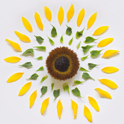
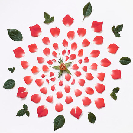
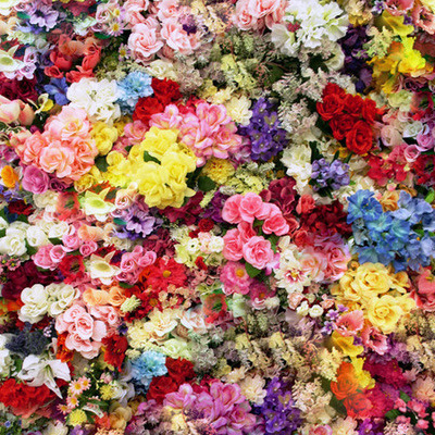
We will be using an <img> tag for this section. If you need an image to play around with, fill free to use this one or this one or this one.
One interesting thing that we can do with <svg> tags is that we can actually use it to alter our media HTML elements, such as <img> tags. We can create shapes within a <clipPath> tag inside of the <svg> tag, which will be used to clip the element that it is applied to.
One important thing to note here would be that both the width and height of the SVG has to be set to 0. You can, of course, try to give values for the width and height. You will realize that when this is done, it will actually occupy "invisible" space for the width and height you give.
Using SVG clipPath:
<svg width="0" height="0">
    <clipPath id="circleClip">
        <circle cx="125" cy="125" r="120" />
    </clipPath>
</svg>
<img width="250px" src="img/flower.jpg" style="clip-path: url(#circleClip)">
The difference between simply creating a circle shape in svg and creating a circle to be used for clipping is that the <clipPath> tag comes around the <circle> tag. The <clipPath> tag also needs an id assigned to it so that, like with svg filters, it can be referenced using the url() CSS function to give as the clip-path css property for our <img> tag.
You can also create multiple shapes within the <clipPath> tag. The image will be visible within all the shapes you create inside of the <clipPath> tag.
<svg width="0" height="0">
    <clipPath id="stripClip">
        <rect x="15" y="50" width="25" height="150" />
        <rect x="65" y="25" width="25" height="200" />
        <rect x="115" y="0" width="25" height="250" />
        <rect x="165" y="25" width="25" height="200" />
        <rect x="215" y="50" width="25" height="150" />
    </clipPath>
</svg>
<img width="250px" src="img/flower.jpg" style="clip-path: url(#stripClip)">
We can also animate our shapes inside of the <clipPath> tag using @keyframes animation. For this, we also need to give an id to the shape tage, in this case the <circle> tag, so that we can apply the css to it.
CSS:
#clipping-circle{
    animation: upAndDown 2s alternate infinite;
}

@keyframes upAndDown {
    from{
        transform: translateY(125px) translateX(-60px);
    }
    to{
        transform: translateY(0px) translateX(60px);
    }
}
HTML:
<svg width="0" height="0">
    <clipPath id="circleClip">
        <circle id="clipping-circle" cx="125" cy="60" r="50" />
    </clipPath>
</svg>
<img class="center-img" width="250px" src="img/flower.jpg" style="clip-path: url(#circleClip)">
Using CSS clip-path:
However, if you are trying to animate clipping of our shapes / images, you will see difficulties in achieving that using <clipPath> tag of <svg>. There are ways to animate within the <svg> tag, but it will quickly become unnecessarily complex. If you are looking to do clipping animation, there is a CSS alternative!
We still use the clip-path css property to apply to the image that we want to clip. However, instead of using the url() css function, we can actually define our clipping shape here. There are 4 basic shapes that you can use as values for the clip-path css property: inset(), circle(), ellipse(), and polygon().
inset() defines how much to go towards the inside of the image. We can use this in the form of inset(x% y%), where the x% defines the percentage in relative to width that it will decrease from both left and right side of the image and y% defines the percentage in relative to height that it will decrease from both top and bottom of the image.
CSS:
#inset-clip{
    animation: insetAni 2s alternate infinite;
}

@keyframes insetAni{
    from{
        clip-path: inset(0% 0%);
    }
    to{
        clip-path: inset(10% 25%);
    }
}
HTML:
<img id="inset-clip" width="250px" src="img/flower.jpg">
circle() creates a circle clipping shape. It is used in the form of circle(r%), where r% is the percentage in relative to width that will be used for the radius of the circle.
CSS:
#circle-clip{
    animation: circleAni 2s alternate infinite;
}

@keyframes circleAni{
    from{
        clip-path: circle(45%);
    }
    to{
        clip-path: circle(15%);
    }
}
HTML:
<img id="circle-clip" width="250px" src="img/flower.jpg">ellipse() is similar to circle() shape, but requires additional value. It is used in the form of ellipse(rx% ry%) where rx% refers to the percentage in relative to the width that will be used for the x radius, and ry% refers to the percentage in relative to the height that will be used for the y radius.
CSS:
#elli-clip{
    animation: elliAni 2s alternate infinite;
}

@keyframes elliAni{
    from{
        clip-path: ellipse(15% 45%);
    }
    to{
        clip-path: ellipse(45% 15%);
    }
}
HTML:
<img id="elli-clip" width="250px" src="img/flower.jpg">polygon() basically works like the <polygon> tag for svg that we saw earlier. We need to give specific coordinates for each of the points of our shape. It is used in the form of polygon(x1% y1%, x2% y2%, x3% y3%), where each coordinates are separated by commas and x and y coordinates are separated by a space.
CSS:
#poly-clip{
    animation: polyAni 2s alternate infinite;
}

@keyframes polyAni{
    from{
        clip-path: polygon(0% 0%, 100% 0%, 100% 100%, 0% 100%);
    }
    to{
        clip-path: polygon(75% 15%, 15% 50%, 30% 85%, 95% 60%);
    }
}
HTML:
<img id="poly-clip" width="250px" src="img/flower.jpg">
One thing to note for using polygon() is that if you are using it to animate, you need to have equal number of points for the beginning sequence of your animation and the ending sequence of your animation, like it is in the example above. You will also see that the order of the points defined also matter in creating a particular animation.